Python streamlines tasks requiring multiple steps in a single block of code. For this reason, it is a great tool for querying and performing analysis on data.
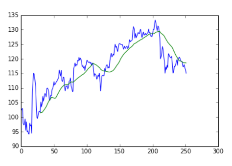
Last post we created a DataFrame containing the daily ticker data for a specific stock and calculated its 30 day moving average. In this post, we will take it a step further and plot the DataFrame in order to visualize its contents.
1. Code from last post.
import pandas as pd
import pandas.io.data as web

stocks = ['FB']
def get_stock(stock, start, end):
     return web.get_data_yahoo(stock, start, end)['Adj Close']
px = pd.DataFrame({n: get_px(n, '1/1/2016', '12/31/2016') for n in names})
px['30 mavg'] = pd.rolling_mean(px, 30)
px
2. Import the matplotlib modules.
import matplotlib.pyplot as plt
%matplotlib inline
3. Call the plot function.
plt.plot(px)
There you have it! We used matplotlib to visualize our DataFrame. Looks like the stock tanked towards the end of 2016, perhaps due to the US Presidential Election 😉
Here is the full code:
import pandas as pd
import pandas.io.data as web
import matplotlib.pyplot as plt
%matplotlib inline

stocks = ['FB']
def get_stock(stock, start, end):
     return web.get_data_yahoo(stock, start, end)['Adj Close']
px = pd.DataFrame({n: get_px(n, '1/1/2016', '12/31/2016') for n in names})
px['30 mavg'] = pd.rolling_mean(px, 30)
plt.plot(px)